top of page

Kroger - Grocery app usability study
Quantitative and qualitative measures for a grocery app usability study.
Role
Researcher
Duration
Nov 23 - Jan 24
Context
Kroger's shopping app usability study is focused on understanding Kroger's grocery shopping app to enhance its user experience and provide recommendations for an intuitive experience to the users.
Objective
The primary objective of this user experience study for the grocery app is to assess the two main user flows: users' onboarding journey and the awareness of the ‘My List’ feature within the Kroger app. This study aims to gauge the level of convenience it offers and gain insights into users' overall satisfaction and experience.
Target audience
Our user demographics span a broad spectrum, encompassing different age groups ranging from 21 to 57 years and representing both American and Asian backgrounds who are regular customers of Kroger.
Task 1:
Complete the onboarding process
Task 2:
Using the My List feature and manipulating the list.
Approach
Planning
Recruiting participants
Research Protocol
Data gathering
Qualitative Data (Interviews)
Analysis
Usability test
Affinity Mapping
Qualitative and Quantitative Data (Think aloud &
SUS Score)
Design Recommendations
Methods and data analysis
Interviews were conducted to gather data. In addition, for data synthesis, we used affinity mapping. We used evaluation methods like SUS and think-aloud to assess the usability of the existing application.We conducted a total of two think-aloud, interview sessions, and observations each, per team member. These sessions yielded both quantitative data gathered during the sessions and qualitative data derived from user observations and feedback. After individually sorting through this information, we began identifying recurring themes and patterns, providing valuable insights into user interactions and experiences with the application.
12
User Interviews
12
Think Aloud
12
Observations
Data Gathering (Qualitative Analysis)
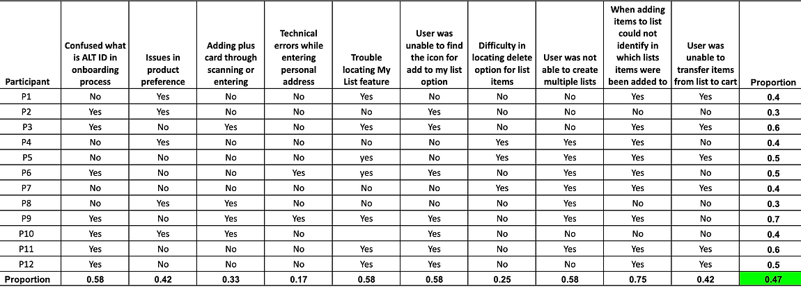
Utilizing a semi-structured interview approach, we gathered qualitative data for our study, focusing on uncovering individual pain points within the main user flow. Our set of questions included post-observation and probing inquiries, each designed to elicit specific insights.
Clear success criteria were assigned for methodically recording the collected data.

#issue with the existing user experience
The onboarding process was found to be lengthy and time-consuming.
#issue with the existing user experience
Participants had difficulty locating and understanding the "My List" feature.
#issue with the existing user experience
Participants encountered confusing text fields during onboarding.
#issue with the existing user experience
Participants found it challenging to navigate and manipulate multiple lists, leading to confusion about where items were added.
#issue with the existing user experience
Participants were not familiar with some of the jargon and icons used in the app.
#issue with the existing user experience
Participants faced difficulties when attempting to remove items from their lists.
Analysis
After analyzing the collected data, we discerned recurring themes and patterns, enabling the generation of codes to identify the core issues within the current app's user experience. Subsequently, personas were crafted to establish a comprehensive understanding of our target users.
Identified codes
Uncommon fields, Confusions, Unnecessary data, Finding feature, Update list items, Feedback, User expectation vs App functionality, Usefulness of ‘My,, List’ feature, Icons, Navigation, Kroger’s Plus
Affinity Map & Personas
Usability testing (Qualitative and Quantitative testing)
Probability of Detection
We initiated the process by defining tasks along with their respective success and failure criteria. Subsequently, each team member conducted two think-aloud sessions. Quantitative data was collected during these sessions, complemented by qualitative insights obtained through user observations and feedback. Following individual analysis and categorization, common themes and patterns began to emerge, providing valuable insights into user interactions and overall user experience with the application. Once the data was consolidated, we identified user issues and assessed their frequency using the probability of detection method.
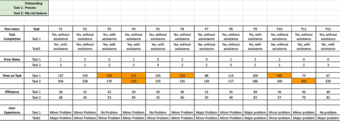
Performance Metrics
In our examination of the time durations for 12 different users completing two designated tasks in the application, we initially standardized the time measurements to seconds for uniformity. Employing Z-scores, calculated based on the mean and standard deviation for each task, we aimed to identify outliers in the dataset. In the context of the first task, involving the onboarding process, we pinpointed one outlier who took an exceptionally longer time, registering 449 seconds for completion. Similarly, in the second task, where users were tasked with adding products to their list and transferring them to the cart, another outlier emerged, spending 432 seconds to accomplish the entire process. The presence of these outliers suggests instances of notably extended task completion times relative to the average. This observation prompts consideration for further investigation into potential usability issues or unique user challenges specific to these outliers.
System Usability Scale (SUS)
In assessing whether there is sufficient evidence to assert that the perceived usability of the interface is high, considering an SUS score greater than 80, a hypothesis test was conducted. Given that the calculated t-score (-2.85) falls below the critical value (-1.36), there is substantial evidence to reject the null hypothesis (H0) suggesting that the perceived usability of the interface is not high (SUS score <= 80).
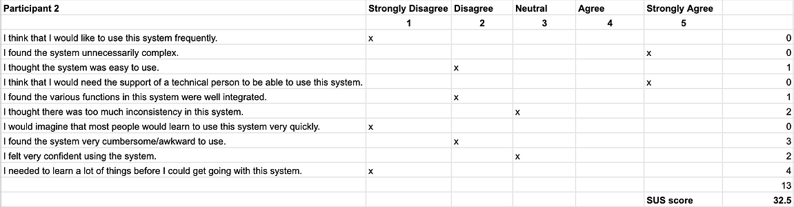
Mean SUS Score: 64.17
T Score: -2.85
Recommendations
Reduce user frustration by unnecessary information from the onboarding process:
Requirements of address input and Kroger’s pay setup should be added on to a later stage, i.e. asking for the address during checkout.
Make My List more evident to the user:
This could be added in the bottom navigation bar on the home screen or as a bubble button on the bottom right of the home screen.
The My List feature does not match with a common conceptual idea people have about favorites:
The feature can either be matched with the user’s perception or designed to deploy the concept clearly to the user.
The concept of checklist and adding to cart should be distinct and clearly identifiable:
Give a toggle button on the home screen to change between in-store and online shopping. In-store would activate the ‘checklist’ feature while online shopping would activate the ‘add to cart’ feature.
The user should have control of where the product is being added:
When adding a product to my list the user should be given the option of all the existing lists to select where the product has to be added.
Navigation can be made easier:
A navigation system should be implemented where user can achieve their desired goals without having to go through unnecessary steps.
Learning
This could have been done to yield better results
For a comprehensive task analysis, exploring sub-tasks would have delved into micro-level details, offering a more nuanced perspective to enhance the user experience. While the holistic approach provided insights into overall task usability, a focus on sub-tasks could have pinpointed specific areas needing improvement with greater accuracy.
bottom of page